Understanding Icons and Their Importance
Icons are an essential element in both digital and physical design. They exist as visual representations that communicate complex ideas simply and quickly. Their ability to convey meaning without the need for extensive text makes them invaluable in today’s fast-paced digital environments. For example, incorporating icons into web design can significantly enhance user experience and navigation. They guide users intuitively through content and functionality, establishing a visual language that promotes clarity and efficiency.
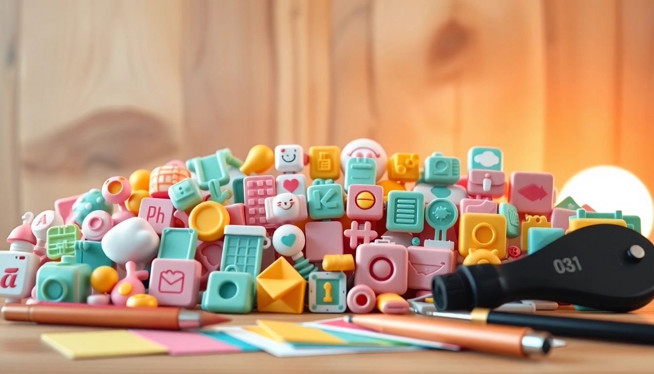
What Are Icons?
Icons are graphical representations that symbolize actions, objects, or concepts. In digital design, icons serve as navigational aids or functional buttons that help users carry out tasks effectively. They can range from simple graphics like a trash can representing ‘delete’ to more abstract symbols like a gear indicating ‘settings.’ Icons often blend artistry with functionality, and the best designs achieve a balance between aesthetic appeal and clarity of communication.
The Role of Icons in Digital Design
In the realm of digital design, icons are much more than decorative elements. They play a multifaceted role that includes:
- Guiding User Actions: Well-placed icons can lead users through a process, making it easier to understand tasks without requiring verbal directions.
- Brand Recognition: Icons are often designed to align with brand identity, assisting in building brand equity over time.
- Reducing Cognitive Load: By representing complex ideas visually, icons help decrease the effort users must expend to understand what to do, leading to a smoother user experience.
- Enhancing Aesthetics: Icons can add visual interest and a level of professionalism to designs, contributing to an overall appealing layout.
Common Uses of Icons in Various Industries
The application of icons extends across numerous industries, with each sector leveraging them to meet specific needs:
- Tech Industry: Icons are frequently used in software interfaces, helping users navigate through applications seamlessly.
- Healthcare: Medical institutions utilize icons in their informational and educational materials to represent services such as pharmacy, emergency care, and insurance options.
- Retail: E-commerce platforms use icons for product categories, payment methods, and customer support, streamlining the online shopping experience.
- Urban Planning: City maps and transportation guides often use icons to denote bus stops, parks, and landmarks, making navigation easier for locals and tourists alike.
Types of Icons: From Flat to 3D
Flat Icons vs. 3D Icons
Icons can be differentiated based on design style, with two prominent types being flat icons and 3D icons. Flat icons are characterized by minimalistic design and lack of gradients or shadows. They are favored for their clean appearance and effectiveness in various sizes. This simplicity often enhances usability on mobile devices where screen real estate is limited. In contrast, 3D icons incorporate depth and intricate design elements, providing a richer visual experience but often at the cost of clarity when scaled down.
Choosing the Right Type for Your Project
The choice between flat and 3D icons depends significantly on the context and objectives of your project. For instance, a modern app might benefit from flat icons to maintain a sleek and contemporary feel, while a gaming platform may choose 3D icons to convey a sense of immersion and excitement. Considerations include:
- Target Audience: Understand who your users are and what visual language resonates with them.
- Brand Aesthetics: Align icon styles with your brand’s visual identity and purpose to maintain consistency.
- Functionality: Ensure the chosen style enhances navigational ease and does not detract from functionality.
Accessibility and Inclusivity of Icons
Inclusivity remains a cornerstone of effective design, and icons should cater to all users, including those with disabilities. Choosing recognizable representations and providing text labels can significantly improve accessibility. Additionally, a color contrast sufficient to aid visually impaired users ensures that icons are discernible to everyone. Following accessibility standards such as the Web Content Accessibility Guidelines (WCAG) can further augment usability.
Best Practices for Designing Icons
Design Principles to Keep in Mind
Creating effective icons requires adherence to certain design principles. These include:
- Clarity: Icons must be straightforward, allowing users to understand their function without confusion.
- Consistency: A cohesive style across icons promotes a unified look and feel within the overall design.
- Scalability: Icons should remain recognizable at various sizes, from small mobile screens to large desktop displays.
- Relevance: Icons should represent the action or concept intuitively regarded by the intended audience.
Color Theory in Icon Design
Color plays a pivotal role in icon design. Every color has psychological implications that can influence a user’s perception and emotional reactions:
- Red: Often signifies warnings or errors.
- Green: Conveys approval, safety, or go actions.
- Blue: Associated with trust and professionalism.
- Yellow: Often alerts or draws attention.
Choosing color palettes that reflect the message while ensuring visual harmony can significantly enhance user engagement with icons.
Creating a Cohesive Icon Set
When designing a suite of icons, cohesion is key. Consistent line weights, styles, and color schemes unify the collection and create a sense of professionalism. Tools like grid systems can help maintain symmetry and alignment. Additionally, consider whether your icons will incorporate a common theme or narrative, which can further enhance their collective impact.
Finding and Utilizing Icon Resources
Top Icon Libraries to Explore
Numerous online resources offer extensive libraries of icons, both free and premium. Some notable platforms include:
- Flaticon – Offers a vast collection of vector icons and stickers.
- Icons8 – Features over a million icons available in various formats.
- Noun Project – A widely utilized resource for iconography across multiple themes.
- Font Awesome – Known for its extensive and customizable icon sets.
Free vs. Premium Icons: Weighing the Options
When selecting icons, designers often face the choice between free and premium options. Free icons come with limited functionalities and less customization. However, they are practical for budget-conscious projects. On the other hand, premium icons typically offer a wider variety, high-quality designs, and better support options, which can be beneficial for professional applications. Evaluate your project needs against available resources to make an informed decision.
Legal Considerations of Icon Usage
It’s important to understand the licenses governing icons to avoid legal ramifications. Free icons may require attribution, whereas premium icons often include usage rights as part of the purchase. Plagiarizing another designer’s work can result in copyright issues, so always ensure icons are used according to their licensing agreements. Maintaining a habit of reading the terms of use can safeguard developers from potential disputes.
Future Trends in Icon Design
Emerging Trends in Iconography
As design technology advances, so do icon trends. Notably, the minimalist trend continues to gain traction, with many brands adapting overly complicated icons into simpler, more effective representations. Additionally, the move towards hand-drawn or organic styles conveys authenticity and relatability. Animation in icons is also on the rise, providing interactive elements that engage users dynamically.
AI and Icons: A Look at Automation
The intersection of artificial intelligence and design is resulting in innovative changes in iconography. AI tools can assist designers by generating icons based on predefined styles or parameters, significantly reducing time spent on initial concepts. However, human oversight remains essential to ensure designs align with brand needs and user expectations. The balance of AI-generated and human-designed icons may define the future of the industry.
Case Studies of Innovative Icon Use in Branding
To illustrate the power of effective iconography, consider notable brands that have embraced icon design successfully:
- Apple: Their consistent use of uniquely stylized icons strengthens brand identity across products and platforms.
- Airbnb: The combination of their logo and icon use creates clear navigational pathways, enhancing user experiences during property searches.
- Trello: The use of task-related icons makes employing their project management tool intuitive for various users.
These examples demonstrate how strategic use of icons can foster familiarity and trust, ultimately enhancing overall brand perception.